


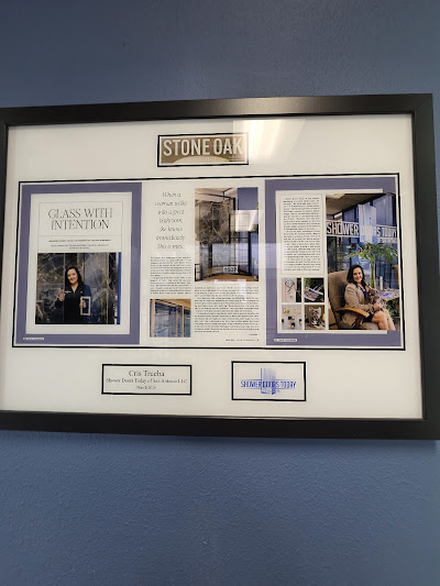
A professional award frame should make the achievement, not the frame, the first thing people notice. A polished presentation comes from the right balance of frame style, proportions, finish, and the recognition being displayed. After working with customers who have turned newspaper features, professional recognition, and other achievements into permanent displays, I’ve found that the best-looking presentation is usually not the busiest one. It is the one that makes the accomplishment feel important.
Many framing guides focus on technical details such as matting, glazing, document size, and preservation. Those details matter, but there is another part of the process that is easy to overlook: how the finished piece makes the achievement feel when someone sees it on the wall.
What Makes an Award Frame Look Professional?
There are four things I look at first:
- The achievement remains the focal point
- The frame fits the style of the recognition
- The proportions look intentional
- The finished piece makes sense in the space where it will be displayed
That sounds simple, but it is where many displays either work or fall short.
A professional award frame doesn’t need to be elaborate. In fact, adding too many decorative elements can take attention away from the recognition itself.
The frame has a supporting role.
That is one of the biggest differences between simply putting something in a frame and creating a professional recognition display.
1. Keep the Achievement as the Focal Point
When someone receives an award or professional recognition, the award is what people should notice first.
The frame should give it structure without competing with it.
For example, a black frame can provide a clean border around a certificate, article, or recognition piece. A wood finish can add warmth when the surrounding room already has traditional furniture or wood accents.
At That’s Great News, the Classic Frame takes this approach. It has a black finish, a 1.25-inch frame thickness, a personalized plate, and a sawtooth hanger.
The important part isn’t simply that the frame is black.
It is that the design gives the recognition a defined presentation while allowing the achievement to remain the focus.


2. Choose a Frame That Matches the Achievement
There isn’t one frame style that works for every achievement.
A traditional wood frame can give an award a warmer, more established appearance. A black frame can feel cleaner and more contemporary.
This is something I’ve seen when comparing different presentation styles at That’s Great News.
Our Wood option uses a 3/4-inch wood base and is available in finishes including mahogany, black, oak, walnut, and white. The Classic Frame takes a different approach with its 1.25-inch black frame.
So I wouldn’t choose a frame simply because someone says it is the “best” frame.
I’d ask:
Where is this going, and what should it look like when someone sees it there?
A professional office with traditional wood furniture may call for something different from a modern reception area.
The frame should make sense with the room.
3. Proportion Matters More Than Decoration
One of the easiest ways to make an award display look less polished is to get the proportions wrong.
A frame that is too small can make the recognition feel cramped. One that is dramatically oversized can make the award look lost inside the display.
Matting can help create visual breathing room around a certificate or document. Framing professionals commonly use mats to separate the document from the frame and direct attention toward the center.
But there’s an important distinction:
More space isn’t automatically better.
The amount of surrounding space should make the complete piece feel balanced.
This is particularly important when you’re displaying something more complicated than a standard certificate.
An article, photograph, certificate, logo, personalized plate, or other supporting element may all need to work together without making the display feel crowded.
4. Think About Where the Award Will Hang
An award that looks good on a website can look completely different when it is hanging in an actual office.
Before choosing a presentation, think about the environment.
For an executive office
A traditional wood finish can work naturally with desks, shelving, and other wood elements.
For a reception area
A clean black frame can provide a professional appearance without demanding too much attention.
For a waiting room
The recognition should be easy to understand from a reasonable distance.
For a recognition wall
Consistency becomes more important. Multiple awards look more intentional when their framing styles have a visual relationship rather than looking like unrelated pieces purchased at different times. Framing specialists also emphasize consistency when creating larger certificate and recognition displays.
The location should influence the presentation.
An Award Doesn’t Have to Start as an Award
This is where my experience with customers has changed how I think about recognition displays.
Some of the most meaningful pieces aren’t traditional trophies or certificates.
They can be newspaper articles, magazine features, professional accomplishments, business milestones, or other forms of public recognition.
That’s one reason I don’t think of a recognition frame as simply a container for a document.
It can preserve evidence of something that happened in someone’s career or life.
For example, I’ve worked with customers who wanted to preserve recognition they received through publications. Instead of leaving the article in a drawer or keeping the publication on a shelf, the achievement could become a permanent display.
That changes what the frame is doing.
It isn’t just protecting paper.
It is helping tell the story of the accomplishment.
A Real Example: Lisa Anderson’s Recognition
One example that stands out is Lisa Anderson’s Lucinda Premium plaque for her work with Hart2Heart Life & Recovery Coaching.
The recognition already existed. The accomplishment had happened.
The plaque gave that recognition a permanent physical form.
What I liked about the finished presentation was that it didn’t need to be overloaded with decoration to feel important. The recognition itself remained the main story.
That’s something I think people sometimes overlook when choosing a professional award frame.
The goal isn’t to make the frame impressive. The goal is to make the achievement look important.
Another Example: Preserving Newspaper Recognition
Another example is Kim Taylor’s wooden plaque, which preserved recognition from a local newspaper.
This is a good example because it isn’t necessarily what someone first imagines when they hear the words “award frame.”
There was no traditional trophy that needed to be displayed.
Instead, there was a meaningful piece of recognition that had appeared in a newspaper.
Turning that recognition into a physical display gave it a different kind of permanence.
And that’s something I think is worth considering if you’ve ever had a professional accomplishment published.
You don’t have to wait for someone to hand you a traditional award before deciding that the achievement is worth displaying.
“Couldn’t I Just Print It and Put It in a Frame?”
I’ve heard this type of objection before, and technically, yes.
You can print an article, certificate, or recognition and put it into a standard frame.
But there is a difference between holding something and presenting something.
A standard frame may do the first job perfectly well.
A professionally designed recognition piece is meant to do the second.
Think about the difference between printing a restaurant menu at home and presenting that same information as part of a professionally designed menu. The information hasn’t changed.
The presentation has.
The same principle applies to recognition.
If the achievement matters enough to preserve, the presentation can reflect that importance.
What Makes a Frame Look Polished Instead of Overdone?
My rule is simple:
If you notice the frame before you notice the achievement, something may be off.
A polished display should have visual hierarchy.
The eye should generally move toward the recognition first, with the frame providing structure around it.
That doesn’t mean every award needs a plain black border.
It means every design element should have a reason to be there.
Consider:
- Is the frame proportionate to the recognition?
- Is the finish appropriate for the room?
- Is the important information easy to see?
- Does the design feel balanced?
- Does the frame support the achievement instead of competing with it?
Those questions are more useful than simply asking, “What is the nicest frame?”
Classic Frame or Wood?
For someone choosing between the two, I would start with the environment rather than the product name.
The Classic Frame has a black, clean professional appearance. It can work particularly well in offices, reception areas, waiting rooms, conference rooms, and other professional spaces.
Wood brings a warmer, more traditional appearance. With choices such as mahogany, oak, walnut, black, and white, it gives you more flexibility when the surrounding décor calls for a particular finish.
Neither approach automatically makes an award look more professional.
The right choice depends on the recognition and the environment around it.
That’s an important distinction because professional presentation isn’t the same thing as expensive-looking presentation.
The Detail People Often Forget: What Happens After You Receive the Award?
Getting recognized is usually the exciting part.
The certificate arrives. The article is published. The award is announced. The recognition gets shared with friends, coworkers, or clients.
Then comes the question:
What do you actually do with it?
It can end up in a drawer.
It can stay inside a folder.
It can become a digital file that you eventually forget about.
Or it can become something you see every day.
That’s one reason I like physical recognition pieces. They take something that happened at a particular moment and give it a place in the physical environment.
A professional achievement becomes part of the office.
A published feature becomes something clients can see.
A career milestone becomes something a family can keep.
The frame helps make that transition possible.
How to Choose a Professional Award Frame
Before ordering, ask yourself these five questions:
1. What exactly am I displaying?
Is it a certificate, newspaper article, magazine feature, photograph, plaque, or several pieces together?
2. What should people notice first?
The answer should usually be the achievement itself.
3. Where will it be displayed?
Consider the wall, furniture, lighting, and overall style of the room.
4. Does the frame support the story?
A professional recognition piece should feel connected to the accomplishment it represents.
5. Will I still like the presentation several years from now?
Recognition is usually meant to last longer than the moment when it was received. Choose a style you can see yourself keeping on the wall.
A Professional Award Frame Should Do More Than Hold an Award
After working with customers and seeing the different ways people choose to preserve their accomplishments, I don’t think the frame should be treated as an afterthought.
The best presentation gives the achievement a clear place in the room.
That’s why a polished award display doesn’t necessarily need more decoration, a larger frame, or the most elaborate design available.
It needs balance.
The award should be easy to see.
The frame should fit the environment.
The proportions should feel intentional.
And most importantly, the finished piece should make you feel like the achievement deserved to be preserved.
If you’re looking for a professional way to turn a meaningful article, certificate, or recognition into a permanent display, explore the That’s Great News frame options and compare the different styles before choosing the presentation that fits your achievement.